This post is work in progress, and will be updated.
If a rather universal analysis process comprises a workflow as complex as:
- computing cross-distances and differences
- grouping and binning
- temporospatial aggregation with meaningful summary parameters
- optional Eigenanalysis
- regression and statistical modeling
- interpolation
… and, on the way:
- handling directional anisotropy and sparse/irregular sampling
- optionally handling temporal discontinuity and missing data
- incorporating outliers, or not
… then you better give it a fancy name so that people ditch the complexity in favor of quickly producing reassuring, smooth figures try implementing it yourself.
Welcome to “variograms”.
I will skip most of the theory, but refer to the literature I found. The glossary appended at the end of this tutorial might help if terms are unclear. Note that I enter this field of geospatial data analysis, or geocomputation, from an untrained perspective: things I write below might fail to meet conventions or common terminology. I use this notebook for personal exploration, and plan to let it grow rather organically, upon need. Still, I hope this perspective provides some seeds for thought.
Table of Contents
- Data
- Cross Distances And Differences
- Grouping and Binning
- Regression
- Eigenanalysis (“PCA”)
- Aggregating Difference Profiles: Scale
- Interpolation
- IDEAs
- Glossary:
- More Resources
Data
general
Each data set brings unique analysis requirements, and thus each analysis has to be bespoke for the data at hand. I will focus on two contrasting analysis examples.
- High resolution elevation data.
- A sparsely sampled set of groundwater chemistry measurements.
Building and testing functions on the first dataset, I will then generalize and apply them for the second. We will use two INBO packages for convenient query of the data. Note that the source of the second dataset (the “watina” groundwater database by INBO) is currently not available on public networks.
The first dataset, however, is publicly accessible via the web API of the data server of “Digitaal Vlaanderen”, who provide the Digital Elevation Model, Vlaanderen (“DHMV”) via the web.
To install the more uncommon packages only briefly required below:
# "inbospatial", which contains functions to query alevation data from the DHMV WCS.
remotes::install_github("inbo/inbospatial",
                        build_vignettes = TRUE,
                        # ref = "dhmv_api",
                        upgrade = TRUE)

# "scatterplot3d"
install.packages("scatterplot3d")
Here are the libraries I build upon:
library("tidyverse")
library("units")
library("sf")
library("terra")
library("inbospatial")
If you would like to chose a different area in Belgium, here you go:
“De Schorre”
An interesting surface example might be “de Schorre”, a public recreational domain close to the city of Boom, south of Antwerp. The area is inhabited by trolls, and once a year by disciples of electronic music entertainment. The latter call it “tomorrow”-land, though actually the landscape was shaped by “yesterday” use as a clay-pit for the brickwork industry, and as a waste dump. As it comes, prominent map features are a troll castle on a mountain, a theatre-like, half-round hill slope, waterholes, and a river stream.
x_test <- 151100
y_test <- 197500
box_range <- 1600 # (+/- m)

xy <- data.frame(c(x_test), c(y_test))
colnames(xy) <- c("x", "y")
xy_sf <- st_as_sf(
  xy,
  coords = c("x", "y"),
  crs = 31370
)
bbox <- sf::st_bbox(
  c(xmin = x_test - box_range/2, xmax = x_test + box_range/2,
    ymin = y_test - box_range/2, ymax = y_test + box_range/2),
  crs = sf::st_crs(31370)
)

elevation <- get_coverage_wcs(
    wcs = "dhmv",
    bbox,
    layername = "DHMVII_DTM_1m",
    resolution = 1,
    wcs_crs = "EPSG:31370", # ? "EPSG:31370"
    output_crs = "EPSG:31370",
    bbox_crs = "EPSG:31370",
    version = "2.0.1"
)

saveRDS(elevation, "test_raster.rds")
elevation_data <- readRDS("test_raster.rds")
resolution <- 1.0 # m/gridcell

png(filename="variograms/figures/deschorre_elevation.png")
plot(elevation_data , col = gray.colors(256))
dev.off()
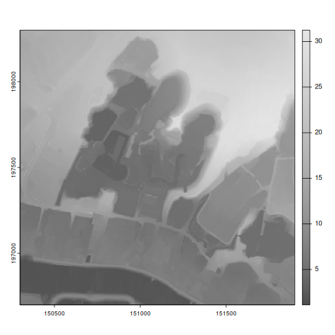
I will occasionally focus on one green hill slope.
slope_area <- elevation_data[280:407, 870:997, drop = FALSE]
plot(slope_area, col = gray.colors(256))
slope_area
These patches of elevation data will be fine to explore the steps of variogram creation.

Cross Distances And Differences
Handling elevation in a raster object is convenient, but it might be more instructive to break data down to base R.
slope_matrix <- as.matrix(slope_area, wide = TRUE)
nrows <- nrow(slope_matrix)
ncols <- ncol(slope_matrix)

midpoint <- data.frame(c(151169+64.5), c(197892+64.5))
colnames(midpoint) <- c("x", "y")
midpoint_sf <- st_as_sf(
  midpoint,
  coords = c("x", "y"),
  crs = 31370
)

# values can be converted to points, for convenience
slope_points <- st_as_sf(as.points(slope_area))
names(slope_points) <- c("elevation", "geometry")

# we will need the center point (position and elevation)
center_almost <- extract(slope_area, midpoint_sf, method = "simple", exact = TRUE, xy = TRUE)
center <- slope_matrix[65, 65]

center
We can calculate the distances and elevation differences of all points, with respect to their center.
slope_points$distance <- st_distance(slope_points, midpoint_sf)
slope_points$difference <- slope_points$elevation - center
slope_points$absolute_difference <- abs(slope_points$difference)

# we will also need a direction

# extract coordinates from geometry
# https://github.com/r-spatial/sf/issues/75#issuecomment-260671835
sf_to_dataframe <- function( sf_points, col_names = c("x","y") ) {
  coords <- do.call(rbind, st_geometry(sf_points)) %>%
    as_tibble(.name_repair = "minimal") %>%
    setNames(col_names)
  return(coords)
}

coords <- sf_to_dataframe(slope_points, col_names = c("x", "y"))
coords$x <- coords$x - midpoint$x
coords$y <- coords$y - midpoint$y
slope_points$direction <- atan2(coords$y, coords$x)

slope_points
Those are many. Maybe focus on the inner circle.
# compute the intersect of collection and buffer
radius <- 8 # [m]
center_points <- slope_points[
  st_intersects(
    st_buffer(midpoint_sf, dist = radius),
  slope_points)[[1]], ]

center_points %>%
  ggplot(aes(x = distance, y = absolute_difference, color = direction, fill = direction)) +
  geom_point()
Good, we have about 200 central points located around an arbitrary location on a hill slope. We know their (relative, absolute) positions, distances, direction, and elevation differences. And we can produce a distance-difference-plot with color direction.
Grouping and Binning
Some non-random google search returns ways to bin the data by distance and direction.
# https://www.statology.org/data-binning-in-r
center_points <- center_points %>%
  mutate(
    distance_bin = as.factor(ntile(distance, n=8)),
    direction_bin = as.factor(ntile(direction, n=8))
    )

binned_center_points <- center_points %>%
  st_drop_geometry() %>%
  group_by(direction_bin, distance_bin) %>%
  summarize(
    absolute_difference = mean(absolute_difference),
    direction = mean(direction),
    distance = mean(distance),
    .groups = "keep"
  )

binned_center_points %>%
  ggplot(aes(x = distance_bin, y = direction_bin, fill = absolute_difference)) +
  geom_tile() +
  xlab("distance") + ylab("direction")
This should be even more beautiful for the whole slope:
slope_points <- slope_points %>%
  mutate(
    distance_bin = as.factor(ntile(distance, n=32)),
    direction_bin = as.factor(ntile(direction, n=32))
    )

binned_slope_points <- slope_points %>%
  st_drop_geometry() %>%
  group_by(direction_bin, distance_bin) %>%
  summarize(
    absolute_difference = mean(absolute_difference),
    direction = mean(direction),
    distance = mean(distance),
    .groups = "keep"
  )

g <- binned_slope_points %>%
  ggplot(aes(x = distance_bin, y = direction_bin, fill = absolute_difference)) +
  geom_tile() +
  xlab("distance bin") + ylab("direction bin")

ggsave("variograms/figures/direction_distance_heatmap.png", g,
       width = 12, height = 8, dpi = 100)
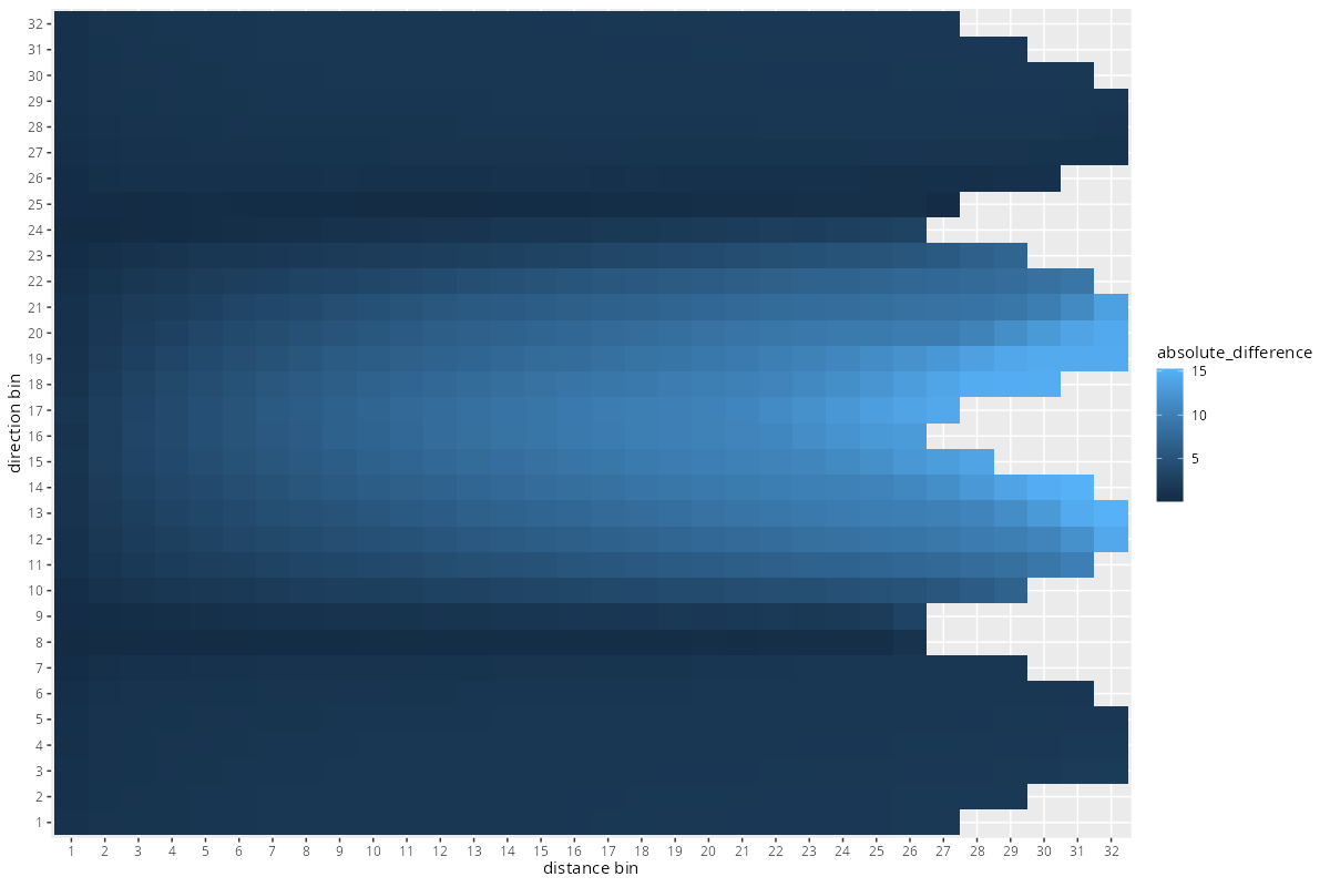
The pattern seems plausible, given we have a slope in north/south direction. The Tobler’esque left-right-gradient seems reassuring.
Regression
regression tools
This is where the fun starts.
g <- binned_slope_points %>%
  ggplot(aes(x = distance, y = absolute_difference, group = direction_bin)) +
  geom_line(aes(color = direction_bin)) +
  xlab("distance bin") + ylab("difference")

ggsave("variograms/figures/distance_difference.png", g,
       width = 12, height = 8, dpi = 100)
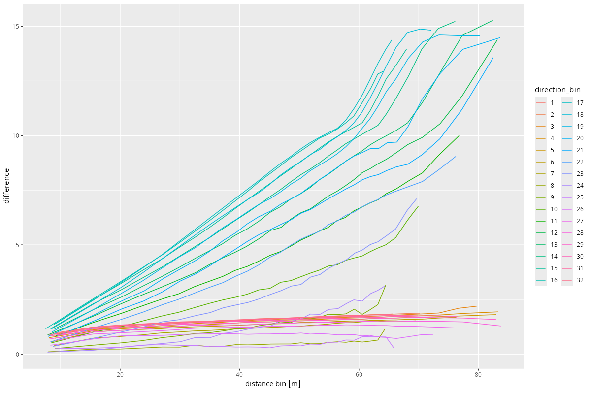
Despite the textbook example, and the regularity in the heatmap above, those difference-distance-plots do not look all too textbook-like.
Nevertheless, let’s focus on one of these to perform a single good regression, manually. The regression should be as general as possible, since we want to play around with different function. Here is a recipe.
onedirection_points <- slope_points %>%
  filter(direction_bin == 15) %>%
  mutate(distance = drop_units(distance))

# onedirection_points %>%
#   ggplot(aes(x = distance, y = absolute_difference, color = distance_bin)) +
#   geom_point()

x <- onedirection_points %>% pull(distance)
z <- onedirection_points %>% pull(absolute_difference)

px = seq(0, ceiling(max(onedirection_points$distance)), length.out = nrow(onedirection_points))
range_param <- drop_units(max(slope_points$distance))
To understand the tools we have, start with linear. Of course, I want a nice and slender optimizer, yet universal regression toolkit.
linear_function <- function(x, params) {
  return(params[1] + params[2]*x)
}

wrap_target_function <- function(x, z, regressor, params) {
  predictions <- regressor(x, params)
  differences <- z - predictions
  return(sum(differences^2))
}

create_prediction_function <- function(regressor, results) {
  fcn <- function (x) {
    regressor(x, results$par)
  }

  return(fcn)
}

print_regression_results <- function(orsl, label = "") {
  par <- paste(round(orsl$par, 2), collapse = ", ")
  conv <- orsl$convergence
  eps <- orsl$value
  print(sprintf("conv %i at (%s): eps %.1f %s", conv, par, eps, label))
}
optimizer_results <- optim(
  par = c(0, 1),
  fn = function(params) {
    wrap_target_function(x, z, linear_function, params)
  }, method = "L-BFGS-B"
)

print_regression_results(optimizer_results, label = "linear")

predictor_function <- create_prediction_function(linear_function, optimizer_results)

g <- onedirection_points %>%
  ggplot(aes(x = distance, y = absolute_difference, color = distance_bin)) +
  geom_point() +
  geom_line(aes(x = px, y = predictor_function(px)))


ggsave("variograms/figures/regression_linear.png", g,
       width = 12, height = 8, dpi = 100)
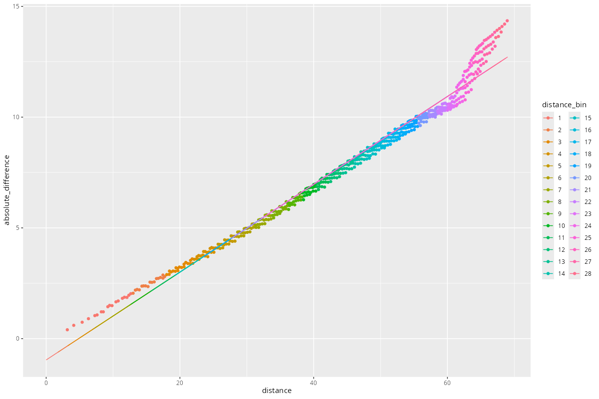
Okay fit, yet the nugget is negative.
Let’s attempt to fit other functions, with another convenience wrapper.
process_regression <- function(x, z,
                regression_function,
                start_values,
                label = "",
                method = "L-BFGS-B",
                ...) {

  # run the regression
  optimizer_results <- optim(
    par = start_values,
    fn = function(params) {
      wrap_target_function(x, z, regression_function, params)
    }, method = method,
    ...
  )

  # print the result
  print_regression_results(optimizer_results, label = label)

  # create the predictor function with optimal parameters
  pred_x = seq(0.01, ceiling(max(x)), length.out = length(x))
  predictor_function <- create_prediction_function(regression_function, optimizer_results)

  # plot prediction
  g <- cbind(x, z) %>%
    as_tibble(.name_repair = "minimal") %>%
    setNames(c("x", "z")) %>%
    ggplot(aes(x = x, y = z)) +
    geom_point(color = "darkblue") +
    geom_line(aes(x = pred_x, y = predictor_function(pred_x))
    ) +
    ggtitle(paste0("regression: ", label))

  # save the plot
  ggsave(paste0("variograms/figures/regression_", label, ".png"), g,
         width = 12, height = 8, dpi = 100)
  return(optimizer_results)
}
regression functions
exponential
r = range_param
exponential_function <- function(x, params) {
  return(params[1] * (params[2] - exp(-x/r)))
}

res <- process_regression(x, z,
  regression_function = exponential_function,
  start_values = c(0.8, 0.0),
  label = "exponential",
  lower = c(0., 0.)
)
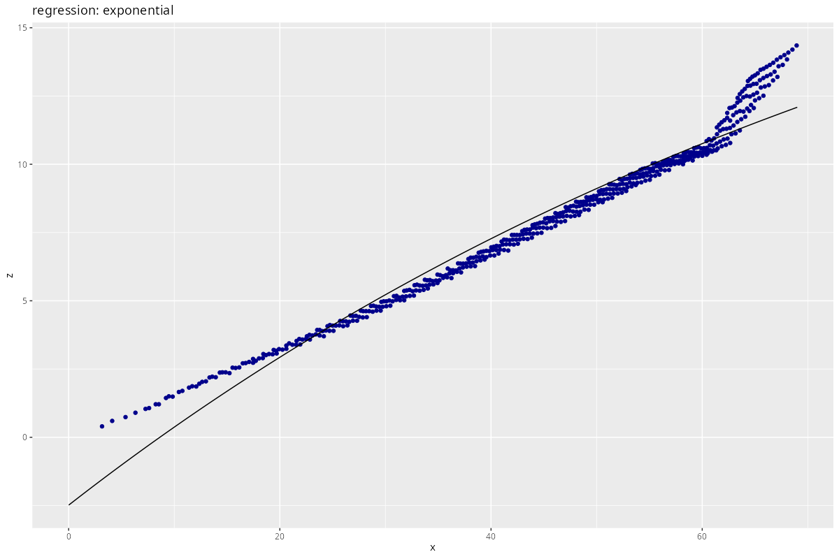
Does not make much sense in this case.
Gaussian
r = range_param
gaussian_function <- function(x, params) {
  c = params[1]
  a = params[2]
  return(c * (1 - exp(-x^a/r^a)))
}

res <- process_regression(x, z,
  regression_function = gaussian_function,
  start_values = c(0.8, 5.0),
  label = "gaussian"
)

Maybe you have enough fantasy left to accept this one?
Matérn
Matérn kernels seem to be a generalization of RBF:
- https://andrewcharlesjones.github.io/journal/matern-kernels.html
- https://scikit-learn.org/1.5/modules/generated/sklearn.gaussian_process.kernels.Matern.html
- https://search.r-project.org/CRAN/refmans/rSPDE/html/matern.covariance.html
r <- range_param
matern_function <- function(x, params) {
  nu <- params[1]
  sigma <- params[2]
  c <- params[3]
  # kappa <- params[1]

  matern <- (sigma^2) / (2^(nu-1)*gamma(nu)) * (x/r)^nu * besselK(x/r, nu)

  return(c*(1-matern))
}

res <- process_regression(x, z,
  regression_function = matern_function,
  start_values = c(1.18, 0.99, 46.0),
  label = "matern"
)
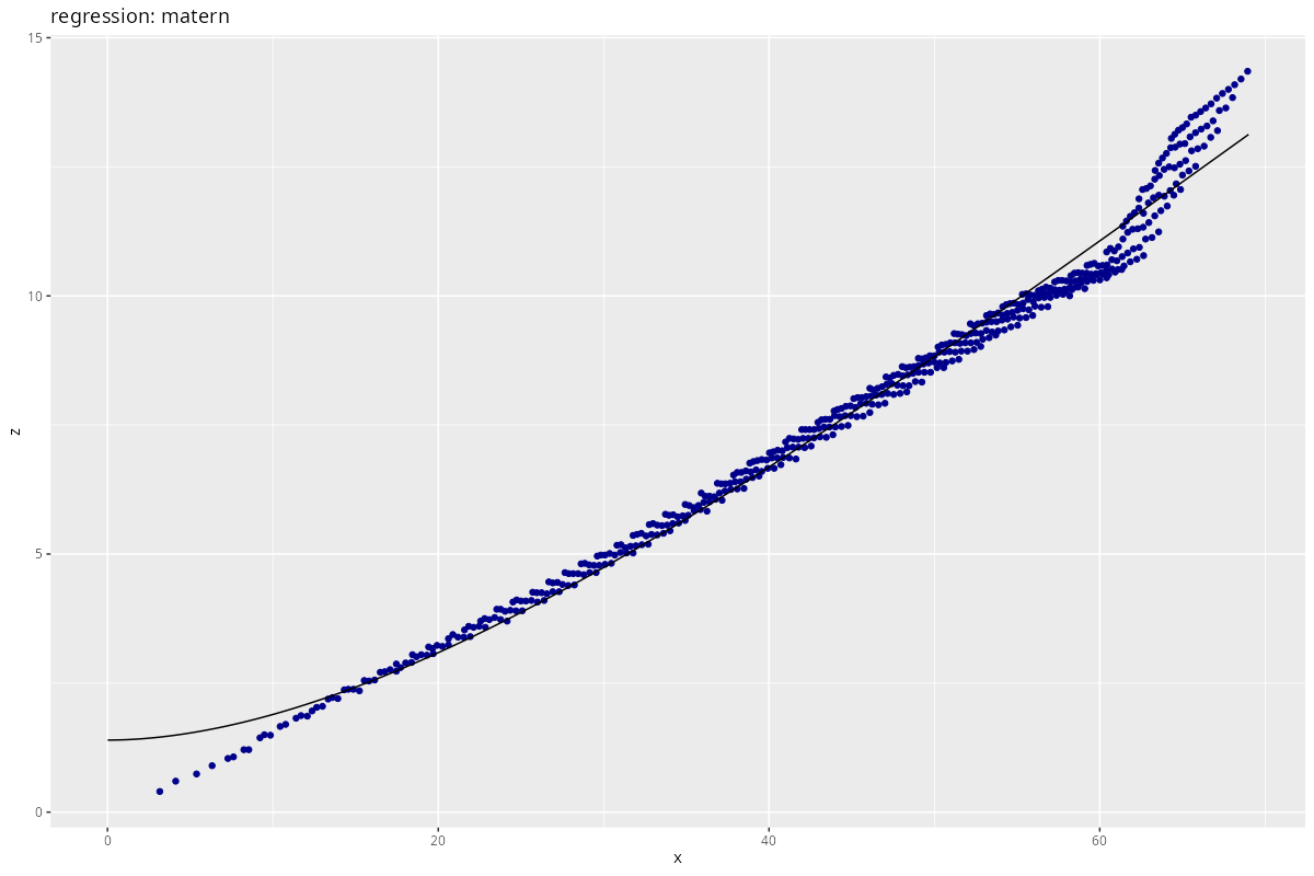
This is so far the best fit - yet it does not seem “good”.
If I am honest, the thing looks piecewise linear to me.
Piecewise Linear
piecewise_linear_function <- function(x, params) {
  intercept1 <- params[1]
  slope1 <- params[2]
  slope2 <- params[3]
  slope3 <- params[4]
  switch1 <- params[5]
  switch2 <- params[6]
  intercept2 <- intercept1 + slope1 * switch1 - (slope2 * switch1)
  intercept3 <- intercept2 + slope2 * switch2 - (slope3 * switch2)

  part1 <- intercept1 + slope1 * x
  part2 <- intercept2 + slope2 * x
  part3 <- intercept3 + slope3 * x
  before1 <- as.integer(x<=switch1)
  before2 <- as.integer(x<=switch2)

  return( part1 * before1 +
          part2 * (1.0-before1) * before2 +
          part3 * (1.0-before2)
         )
}

res <- process_regression(x, z,
  regression_function = piecewise_linear_function,
  start_values = c(0.0, 0.2, 0.4, 0.0, 0.4*range_param, 0.7*range_param),
  label = "piecewise"
)
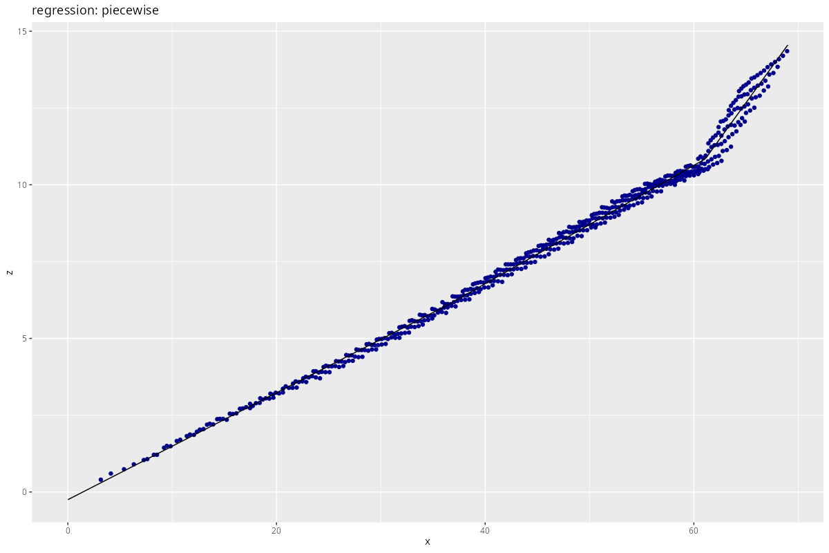
By far the best, yet not generalizable.
intermediate conclusion
Collecting the RMSE of the above regression, for several direction bins:
|------------------|------|-------|-------|--------|-------|
| direction bin    |    5 |    10 |    15 |     20 |    24 |
|------------------|------|-------|-------|--------|-------|
| Linear           |  1.7 | 167.6 |  98.7 |  285.5 | 112.8 |
| Exponential      | 23.0 | 269.3 | 473.4 | 1327.8 | 194.3 |
| Gaussian         |  0.6 | 162.4 | 103.0 |  254.6 |  88.2 |
| Matérn           |  4.0 | 149.5 |  72.7 |  217.1 |  88.9 |
| Piecewise Linear |  0.5 | 133.6 |  22.2 |  197.2 |  84.4 |
|------------------|------|-------|-------|--------|-------|
To keep in mind: this was just a relatively smooth hill slope, almost a linear gradient. With actual actual data, regression should be a mess.
Despite the putatively favorable (i.e. simple) topographic layout, none of the regressions actually fit the data. The conceptually most absurd model, a 3-piecewise linear regression, nominally won the race.
At this point, it seems to me that any regression model I choose is as quantitatively accurate as Tobler’s law.
Take a step back, and look at the mess I created. What happened here?
In fact, the data above is absolutely plausible. The place looks exactly as follows, in cross section, with our observation point at the “x”:
       ______
      /
     x
    /
___/
We are standing on a hill slope, looking in any chosen direction. If we look in the direction orthogonal to the slope, the elevation is constant. In any other direction, we will have a constant slope for some distance, followed by a constant flat (i.e. the rest of Belgium). The transition might spread due to the binning. The piecewise linear regression can well reflect this situation, the others can’t.
The actual problem here is in the units. You may have noticed above that I chose the slope_points, not the center_points. This means that we reach $64 m$ in each direction.
A point $64 m$ away from the observation point provides very little information about the focal location. Tobler’s law holds. I learned a lesson here.
In addition to this first error, keep in mind that we are still only looking at a single point. Later, by aggregating multiple observations, we should retrieve a more general, putatively Gaussian spatial difference pattern.
We will re-do the analysis below with only the center_points, still generously encircled ($8 m$). At the same time, I will spice up the recipe with the “major axes” of the slope.
Eigenanalysis (“PCA”)
why?!
Some tutorials (e.g. here for some dubious commercial software with intransparent licensing costs) babble about major and minor axes; others (e.g. this one, “Golden Software”) correctly mentions directional anisotropy for which we would need the direction.
I will give this my own spin by using my good old friend Principal Component Analysis (PCA). PCA is a special type of eigenanalysis, using singular value decomposition; you could also consider it a first step towards “modeling” variogram data.
implementation
The R implementation of PCA seems to be inconvenient. I’ve implemented PCA before; now the day has come to port this to R.
The goal of this step is to perform a principal component analysis of the (x, y, difference) data, centered at the point of interest.
# compute a PCA via SVD of the COV
compute_pca <- function( data, center_point = NULL ) {

  # pca
  pca <- list("colnames" = colnames(data))

  # center; note: standardization not needed (spatial units)
  pca$means <- data %>% summarize_all(mean)
  if (!is.null(center_point)) {
    pca$means$x <- center_point$x
    pca$means$y <- center_point$y
  }
  data$x <- data$x - pca$means$x
  data$y <- data$y - pca$means$y
  pca_input <- as.matrix(data, wide = TRUE)

  # get the covariance matrix
  # https://www.r-bloggers.com/2021/07/how-to-create-a-covariance-matrix-in-r
  pca_cov <- cov(pca_input)

  # eigenanalysis - SVD
  # https://www.rdocumentation.org/packages/base/versions/3.6.2/topics/svd
  s <- svd(pca_cov, nu = 3)
  pca$val <- s$d
  pca$mat <- s$u

  # return pca
  return(pca)
}

# Apply the PCA
pca_transform <- function( data, pca ) {
  # centering
  data$x <- data$x - pca$means$x
  data$y <- data$y - pca$means$y

  # transformed data
  data_trafo <- as_tibble(data.frame(
      as.matrix(data, wide = TRUE) %*% t(pca$mat)
      )) %>%
    setNames(c("V1", "V2", "V3"))
  return(data_trafo)
}

# Un-apply the PCA
pca_retransform <- function( data_trafo, pca ) {
  # retrafo
  retrafo <- as_tibble(data.frame(
      as.matrix(data_trafo) %*% pca$mat
    ))

  # data format
  colnames(retrafo) <- pca$colnames

  # uncenter
  retrafo$x <- retrafo$x + pca$means$x
  retrafo$y <- retrafo$y + pca$means$y

  return(retrafo)
}
This should do. Application as follows:
# prepare the input data
pca_input <- sf_to_dataframe(center_points)
pca_input$difference <- center_points$difference

# pca and transform
center_pca <- compute_pca( pca_input, center_point = midpoint )
center_trafo <- pca_transform( pca_input, center_pca )
center_retrafo <- pca_retransform( center_trafo, center_pca )

stopifnot(sum(abs(center_retrafo - pca_input)) < 1e-6)


# visualize
require("scatterplot3d")

data_plotcheck <- sf_to_dataframe(center_points)
data_plotcheck$difference <- center_points$difference
data_plotcheck$x <- data_plotcheck$x - center_pca$means$x
data_plotcheck$y <- data_plotcheck$y - center_pca$means$y


colnames(data_plotcheck) <- c("x", "y", "z")
colnames(center_trafo) <- c("x", "y", "z")
data_plotcheck$color <- "steelblue"
center_trafo$color <- "orange"

# https://stackoverflow.com/questions/67150066/how-to-create-a-3d-plot-using-two-separate-datasets-in-r
m <- rbind(data_plotcheck, center_trafo)
scatterplot3d(x = m$x, y = m$y, z = m$z,
  color = m$color,
  angle = 0, asp = 1.
  )

center_trafo <- center_trafo %>% select(-color)
colnames(center_trafo) <- c("pc1", "pc2", "pc3")

center_points <- cbind(center_points, center_trafo)
What is the purpose of this transformation? Instead of standing gravity-upright on a slope, we align our view with the surface normal vector of the data at our observation point.
application
Returning to the regression problem above, things have changed:
- Data is directionally invariant, due to PCA.
- Elevation is now the tilted elevation which has to be untransformed.
center_transformed <- center_points %>%
  mutate(
    distance = sqrt(pc1^2+pc2^2),
    absolute_difference = abs(pc3)
  )

binning = TRUE
if (!binning) {
  x <- center_transformed$distance
  z <- center_transformed$absolute_difference

} else {
  center_transformed <- center_transformed %>%
    mutate(
      distance_bin = as.factor(ntile(distance, n=16)),
      )

  binned_center_points <- center_transformed %>%
    st_drop_geometry() %>%
    group_by(distance_bin) %>%
    summarize(
      absolute_difference = mean(absolute_difference),
      distance = mean(distance),
      .groups = "keep"
    )

  x <- binned_center_points$distance
  z <- binned_center_points$absolute_difference
}

# exclude the observation point
z <- z[x>0]
x <- x[x>0]

# new difference-distance-plot:
# plot(x, z)

### Linear
res <- process_regression(x, z,
  regression_function = linear_function,
  start_values = c(0., 0.1),
  label = "center_pca_linear"
)


### Exponential - not meaningful here
# r = max(x)
# exponential_function <- function(x, params) {
#   return(params[1] + params[2] * exp(params[3]*x/r))
# }
# start_values = c(0., 0.02, 0.001),
# lower = c(-Inf, 0., 0.)

### Gaussian
r = max(x)
gaussian_function <- function(x, params) {
  return(params[3] + params[1] * (1 - exp(-(x/r)^params[2])))
}
res <- process_regression(x, z,
  regression_function = gaussian_function,
  start_values = c(1., 1., 0.),
  label = "center_pca_gaussian",
  method = "L-BFGS-B",
  lower = c(0., 0., -Inf)
)


### Matérn
l = max(x)
matern_function <- function(x, params) {
  nu <- params[1]
  l <- params[2]
  c <- params[3]
  c0 <- params[4]

  matern <- 2^(1-nu) / gamma(nu) * (x/l)^nu * besselK(x/l, nu)

  # return(1.-matern)
  return(c0 + c*(1.-matern))
}
res <- process_regression(x, z,
  regression_function = matern_function,
  start_values = c(1.0, 100., 1., 0.),
  label = "center_pca_matern",
  method = "L-BFGS-B",
  lower = c(1e-6, 0., 0., -Inf)
)
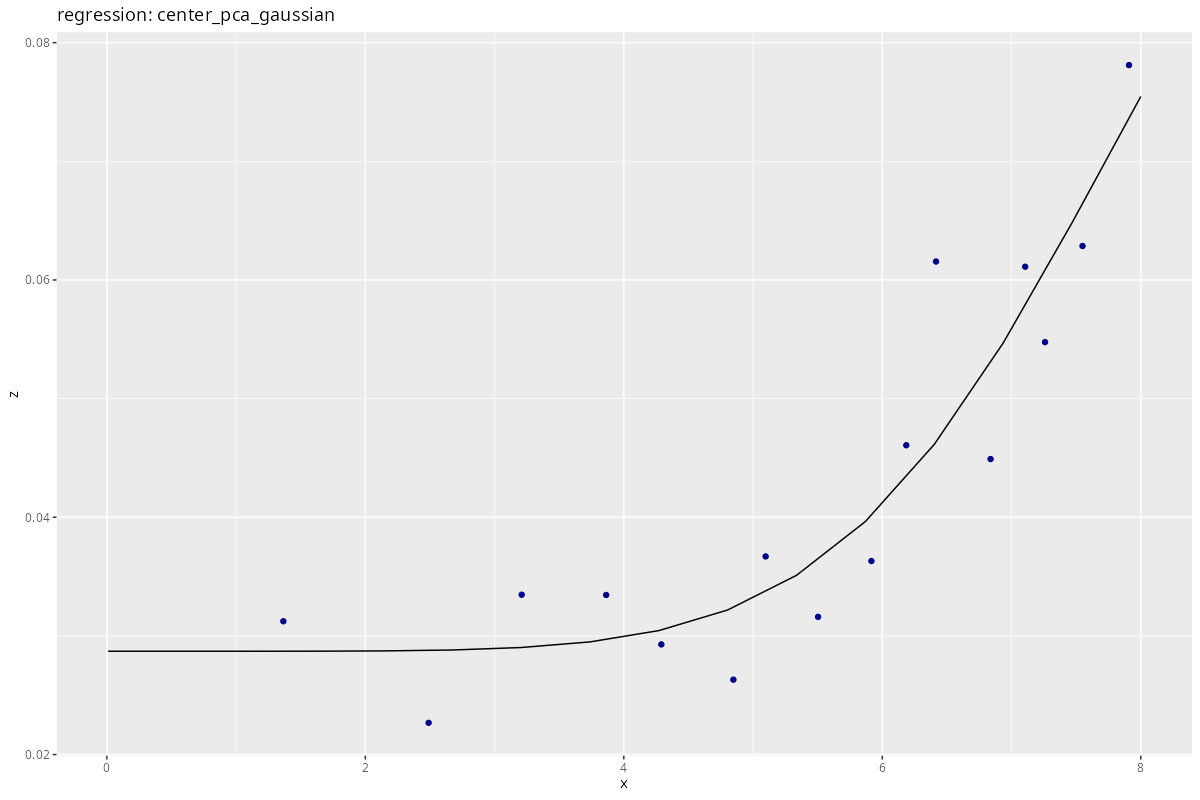
Except for the linear one, regressions look much better now!
Some things to keep in mind:
- Our data subset is good to fit the
nugget, yet we’re not at therangeandsillyet. - To aid the optimizer, it is useful to set meaningful parameter bounds via the
lowerandupperkeywords. - Binning, here by distance, does not much affect the regression.
There remain things TODO:
- I did not succeed in reliably fitting the Matérn function; probably my mis-parametrization, or too little data per dof.
- Retransformation: use
pca_retransformto return to the real space. - Robust regression: handle outliers.
- Prediction of the zero point (#DIV0 in Matérn).
And, still, this is just the regression for one point of the slope. Time to proceed to the next steps.
Aggregating Difference Profiles: Scale
Problem Setting
The considerations above targeted the analysis of the spatial “difference profile” around a single point, arbitrarily chosen to be the center. This produces sufficiently dense results in the case of the present elvation data because of the high density of sampling points ($1 m$ grid resolution). However, if you
- have a quantity which is less densely sampled, or
- ask questions of general difference patterns across an area,
then you might need to mingle your sample points in a different way.
Here comes some matrix computation.
What we will need are, basically, the axes of the difference-distance plot, cross-tabulated. This means that, instead of computing them one-point-at-a-time, we get the whole shebang in one go.
Difference
Difference should be a good starting point, using the narrow range data for testing. The outer() product with a FUN argument is a powerful tool which applies here.
# A helper function to cross-tabulate the difference between elements in a data column.
# https://stackoverflow.com/questions/21447888/cross-tabulation-of-pair-wise-differences
calculate_column_difference <- function (data, column) {
  outer(X=data[[column]], Y=data[[column]], FUN= function(X, Y) Y-X) %>%
    as_tibble(rownames = NA, .name_repair = "none") %>%
    setNames(rownames(data))
}
calcoldiff <- calculate_column_difference # we will use this more often

calcoldiff(head(center_points, 5), "elevation")
Just as a general reminder, it is always worth double-checking the stuff on stack overflow, even if it is ten years old, even if responders have numerous gold medal achievements, and even if it was the first answer returned by google.
Generalization
With this tool, we can get the elevation differences. Another small step to cross-tabulate the Euclidean distance of coordinates, and their direction towards each other.
compute_cross_euclidean <- function(geom_data) {

  # extract point coordinates
  xy <- sf_to_dataframe(geom_data)

  # Euclidean distance
  dx <- sqrt(calculate_column_difference(xy, "x")^2 + calculate_column_difference(xy, "y")^2)
  return(dx)
}


compute_cross_direction <- function(geom_data) {
  xy <- sf_to_dataframe(geom_data)

  # extract half-matrix
  x <- as.matrix(calculate_column_difference(xy, "x"))
  y <- as.matrix(calculate_column_difference(xy, "y"))

  # the atan2 way of life
  return(atan2(x, y))
}


compute_cross_euclidean(head(center_points, 5))
compute_cross_direction(head(center_points, 5))
(Behold: the cross-direction matrix does not look symmetric, yet in fact, it is!)
So far, so good. Seems quite efficient; wait and see with the “big data”…
Implementation
Wrap both, adding direction to the mix:
retrieve_difference_and_distance <- function(geom_data, diff_column, calculate_direction = FALSE) {

  # cross-tabulate distance and difference
  distance <- compute_cross_euclidean(geom_data)
  difference <- abs(calculate_column_difference(geom_data, diff_column))

  # combine into a tibble
  dist_diff <- as_tibble(cbind(
    distance[lower.tri(distance)],
    difference[lower.tri(difference)]
    ))
  dist_diff <- setNames(dist_diff, c("distance", paste0("diff_", diff_column)))

  # optionally compute direction
  if (calculate_direction) {
    direction <- compute_cross_direction(geom_data)
    # note that the inverse distance/difference should be added
    # to the opposite direction
    dist_diff$direction <- direction[lower.tri(direction)]
  }

  return(dist_diff)

}

# choose a radius, not too far
dist_radius <- 16
n_bins <- dist_radius

# subset points
more_points <- slope_points[
  st_intersects(
    st_buffer(midpoint_sf, dist = dist_radius),
  slope_points)[[1]], ]
print(nrow(more_points))

# cross-tabulate distance
dd <- retrieve_difference_and_distance(
  more_points,
  diff_column = "elevation",
  calculate_direction = TRUE
  ) %>%
  mutate(
    distance_bin = as.factor(ntile(distance, n=n_bins)),
    direction_bin = as.factor(ntile(direction, n=16)),
    )

# binned distance/difference
dd_binned <- dd %>%
    group_by(distance_bin) %>%
    summarize(
      distance = mean(distance),
      difference = mean(diff_elevation),
      .groups = "keep"
    )

# store data for re-use
saveRDS(dd_binned, paste0("variograms/distance_difference_", dist_radius, "m.rds"))
(you might want to avoid plotting)
# visualize
g <- dd %>% ggplot(aes(x = distance, y = diff_elevation,
                       color = direction_bin)) +
  geom_point(alpha = 0.01
           # , fill = "black", color = "black",
           # , position = position_jitter(width = 0.05)
             ) +
  geom_line(data = dd_binned, aes(x = distance, y = difference),
    color = "black") +
  theme_bw()

ggsave(paste0("variograms/figures/distance_difference_", dist_radius, "m.png"), g,
       width = 12, height = 8, dpi = 100)
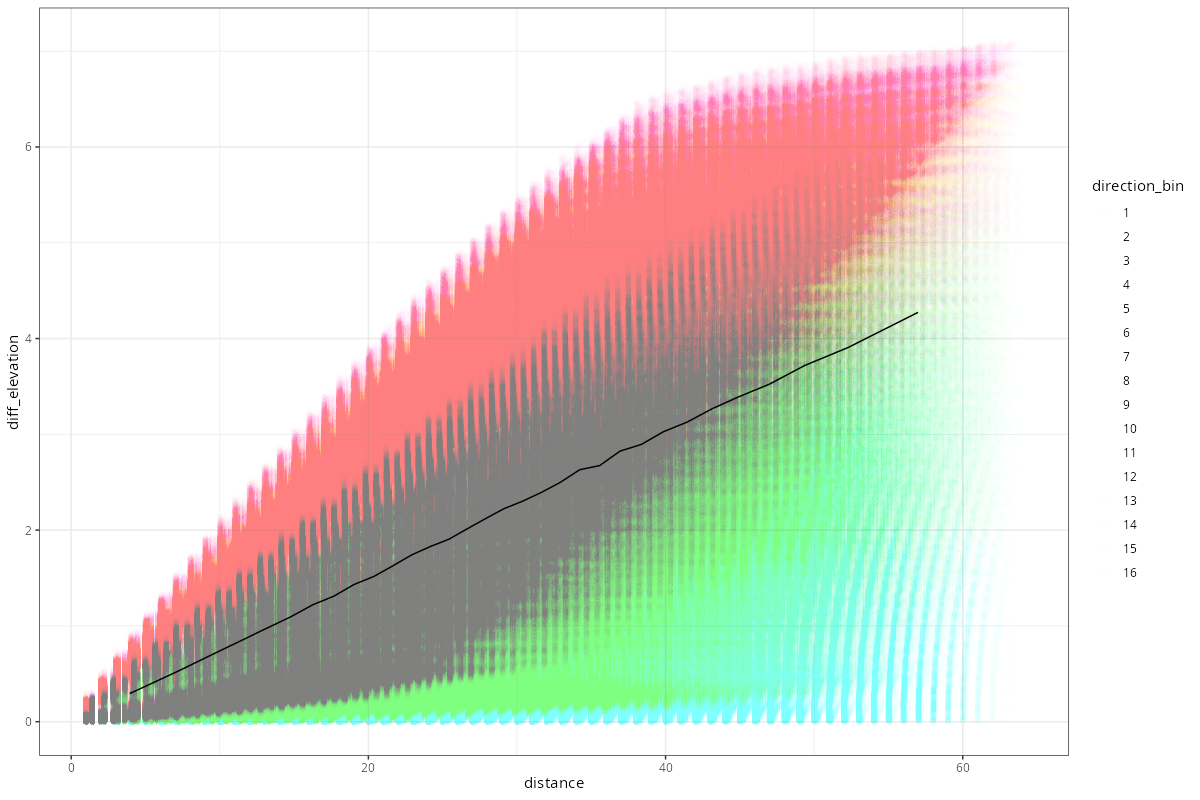
Whereas maximum elevation difference seems to level out at relatively close range, its mean will increase later. Again, this is due to the topographic circumstances (linear slope), as can be seen by the directional anisotropy. The maximum elevation difference we get (i.e. plateau height) depends on the radius of data we look at.
WARNING: your computer power or time might be limiting factor for computations with more than thousand points. Cross-tabulation is not exactly efficient, and color-scatter-plotting large amounts of data is a bad idea. However, calculation should be computationally feasible for not-too-long ranges.
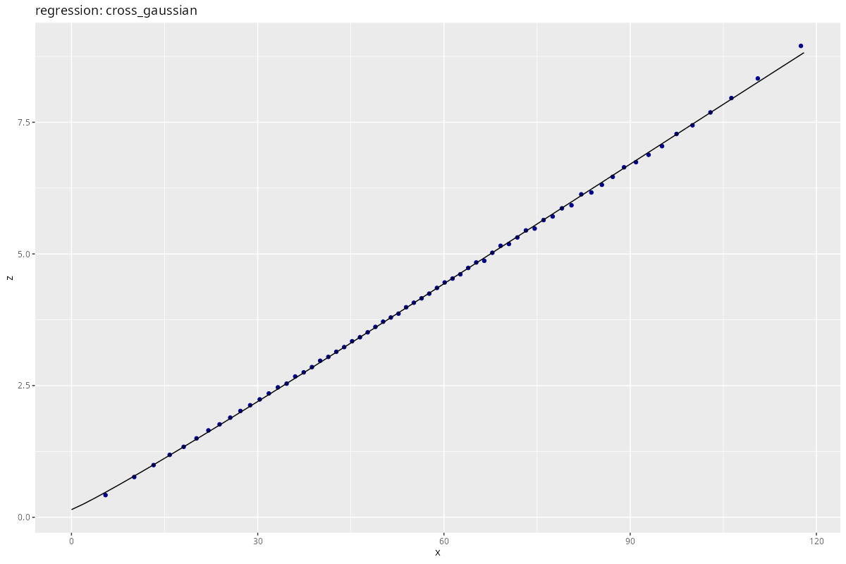
Again, feel free to apply a regression to the difference-distance data:
# loading pre-computed values from a larger range
file_64m <- "variograms/distance_difference_64m.rds"
if (file.exists(file_64m)) {
  dd_binned <- readRDS(file_64m)
}

# regression data, as before
x <- dd_binned$distance
z <- dd_binned$difference


# chosing a Gaussian, again modified to allow close-to-linear data
gaussian_function <- function(x, params) {
  r <- params[4]
  return(params[3] + params[1] * (1 - exp(-(x/r)^params[2])))
}
res <- process_regression(x, z,
  regression_function = gaussian_function,
  start_values = c(100., 1.0, 0.1, 64),
  label = "cross_gaussian",
  method = "L-BFGS-B",
  lower = c(0., 0., 0., 1e-6)
)
Conclusion
It should also be possible to extract the local PCA per point, and with some more trouble correcting the cross-elevation distance for the local PCA. Yet I find it hard to wrap my head around that possibility. Surely there is a better tool to find the surface normal at each point, and cross it with the distance vector.
There is very little noise in the elevation data, and dense sampling prohibids wide-range analysis. So we cannot really speak of nugget and sill in this case.
Nevertheless, the tools above generally apply to large-scale data sets, even with sparse sampling.
Interpolation
tbd.
(exploring the connection with Kriging)
IDEAs
Difference Metrics
IDEA: we could use the normal projection length to quantify difference in first derivative of elevation.
- Calculate normalized surface normal vector at each point (ideally outwards)
- Use the scalar product $\hat{n}_1 \cdot \hat{n}_2$ as distance measure.
This could also be used to identify breaks in areas of homogeneous elevation.
Glossary:
      ^
      | Range
      |<--->
Sill  |     :____,model
      |    /:
 VAR  |   / :
 IOG  |  /  :
 RAM  | /   :
      |/    :
Nugget| Cor.: Uncor.
     _|_____:___________>
      |              lag distance
? what is actually on the $y$ axis?
Observation difference:
- difference in observed values
- need to be compressed to single number for variogram calculation
Nugget:
- Y intercept of the model
- variability at near zero distance
- i.e. non-spatial variability
- indistinguishable from measurement error or mixing populations
- relative nugged: $nugget/sill$
(Effective) Range:
- distance after which ($95%$ of) plateau is reached
- fading of spatial correlation
Sill:
- plateau spatial correlation
- global variance of the data
- related to spatial variability
Continuity:
- $cnt \sim \frac{1}{range}$
- the longer the range, the more continuity (uniform sets are flat)
Experimental / empirical variogram:
- variogram of the observed data (no model/smoothing)
- “empirical” sometimes used for binned version
More Resources
-
http://gaussianprocess.org/gpml/chapters/RW4.pdf Covariance Functions - Gaussian Processes for Machine Learning every α in contrast to the Matérn covariance function in Figure 4.1. The … constant value, consistent with the construction as a superposition of sigmoid.
-
https://pdixon.stat.iastate.edu/stat406/SVmodels.pdf Semivariogram models sigmoid then we recommend the theoretically attractive Whittle function. … The Matérn function is a generalization of several of the functions mentioned.