Last year, I published one of the major findings of my PhD project [1]. It involved a more or less complicated, yet linear model with a reversed modeling approach which relied on predictive sampling.
The manuscript passed the reviewers’ critical assessment, but an adapted version has now faced another jury evaluation as a chapter of my PhD thesis. One big question arose (which I am honestly happy about): the model is trained on data from one group of piglets, and then applied to a different group.
Would [I, the author] expect to be able to predict something the model is not trained for?
In other words: does predictive sampling have a bias towards the training outcome? (This might read a bit cryptic, but I will get to the background below.)
This concern is valid, fundamental, and I was not immediately able to give a conclusive answer. Working on an appropriate response in revision of my thesis led me back to the inner workings of the linear models which I implemented. Below, I will summarize some of my considerations, which are too basic, or too general, and therefore too extensive for revision in the thesis chapter. Nevertheless, I hope that they are instructive for fellow linear modellers.
Abstract / TL;DR
Whether or not out-of-sample prediction can elucidate group differences depends on multiple input factors.
- difference of the training- and test distribution
- slope magnitude (steepness)
- model complexity/size, i.e. number of (other) slopes
- residual variation / noise
- sample size
Because most of these are necessary prerequisites to identify group differences, but none of them is sufficient on its own, negative findings are complicated in the modeling framework.
Not predicting group differences does not exclude that they exist. However, if we find differences in the predictions of the training- and test set, they are robust.
I illustrate these points by creating a simulation environment which emulates various model structures in the statistics toolbox I used. Bivariate distribution plots are particularly valuable for analyzing the outcome.
Introduction & Methods
Linear Models Basics
Acknowledged, this might be too basic; yet I find it necessary to clarify my terminology ex ante.
I use a probabilistic framework to implement my models, namely `PyMC` (version 5.10.2, https://docs.pymc.io). Regardless of framework, any linear model follows a general structure. It tries to capture the relation of an outcome variable \(y\) to one or multiple input variables \(x_k\). Because the relationship is approximately linear, i.e. proportional, i.e. \(y \sim x_k \quad \forall k\), the model contains a slope \(b_k\) and an intercept \(a\). Note that in the simplified case of only one slope, I will switch to drop the index \(k\) and write \(x\) and \(b\), also for disambiguation with index \(i\) which I use below to split the vector elements \(x_{k,i}\) of each slope. Finally, there is a model residual, \(\epsilon\), which is needed to ensure that the “equals” sign holds for each observation in the following (vectorial) model equation:
\(y = a + b \cdot x + \epsilon\)
Which is a compact way to write: \(\begin{pmatrix} y_1 \\ y_2 \\ \vdots \\ y_n \end{pmatrix} = a + b \cdot \begin{pmatrix} x_1 \\ x_2 \\ \vdots \\ x_n \end{pmatrix} + \begin{pmatrix} \epsilon_1 \\ \epsilon_2 \\ \vdots \\ \epsilon_n \end{pmatrix}\)
The variables \(x\) and \(y\) are our observed, putatively related data columns (“observables”). The choice of which is “input” and which “outcome” is arbitrary, but usually constrained by logical reasons. Some tend to call \(x\) on the RHS a “predictor”, because it is the variable which predicts \(y\); yet this term is ambiguous in the present context and I will avoid it. There are a total of \(n\) observations. Parameters \(a\) and \(b\) are the model parameters, to be adjusted in the modeling procedure (e.g. by regression optimization, or in my case MCMC sampling). The residual \(\epsilon\) is the difference between the (modeled) \(a+b\cdot x\) and the actual \(y\). This problem is effectively two-dimensional: one dimension is \(x\), the other \(y\); all the other numbers are a fixed description of their relation.
One additional level of complexity: we may use multiple (a number of \(m\)) data variables and associated slopes. \(y = a + b_1 \cdot x_1 + b_2 \cdot x_2 + \ldots + b_m \cdot x_m + \epsilon = a + \sum\limits_k^m b_k \cdot x_k + \epsilon\)
All of the \(x_k\) together with the \(y\) are observed in experiment, therefore called observables. The regression problem is effectively \(m+1\)-dimensional (degrees of freedom; slopes and intercept); the \(y\) is chosen to be special by describing it as a function of the other observables.
Probabilistic modeling, in a nutshell, uses parameter distributions instead of “single numbers” for model parameters. Take the intercept, for example: it must be a number, we might never know what it exactly is, but we can estimate how likely the “true” intercept will have been a certain number (given the observed data). Technically, the trick is elegant: we just add another (hidden, tensor) dimension, and let the computer try a multitude of possible values (read: an insane number of values) to see which give better outcomes (MCMC sampling). The algorithm gradually narrows an initially wide, “uninformed” distribution to something that makes the model fit the data quite well.
(Limited) Visualization: Bivariate Distribution Plots
A great way to illustrate the linear model is a bivariate distribution plot. They visualize the two observables (or: two of the many observables), both their relation as the scatter plot, and the distribution of values on the margins.
Here an example:
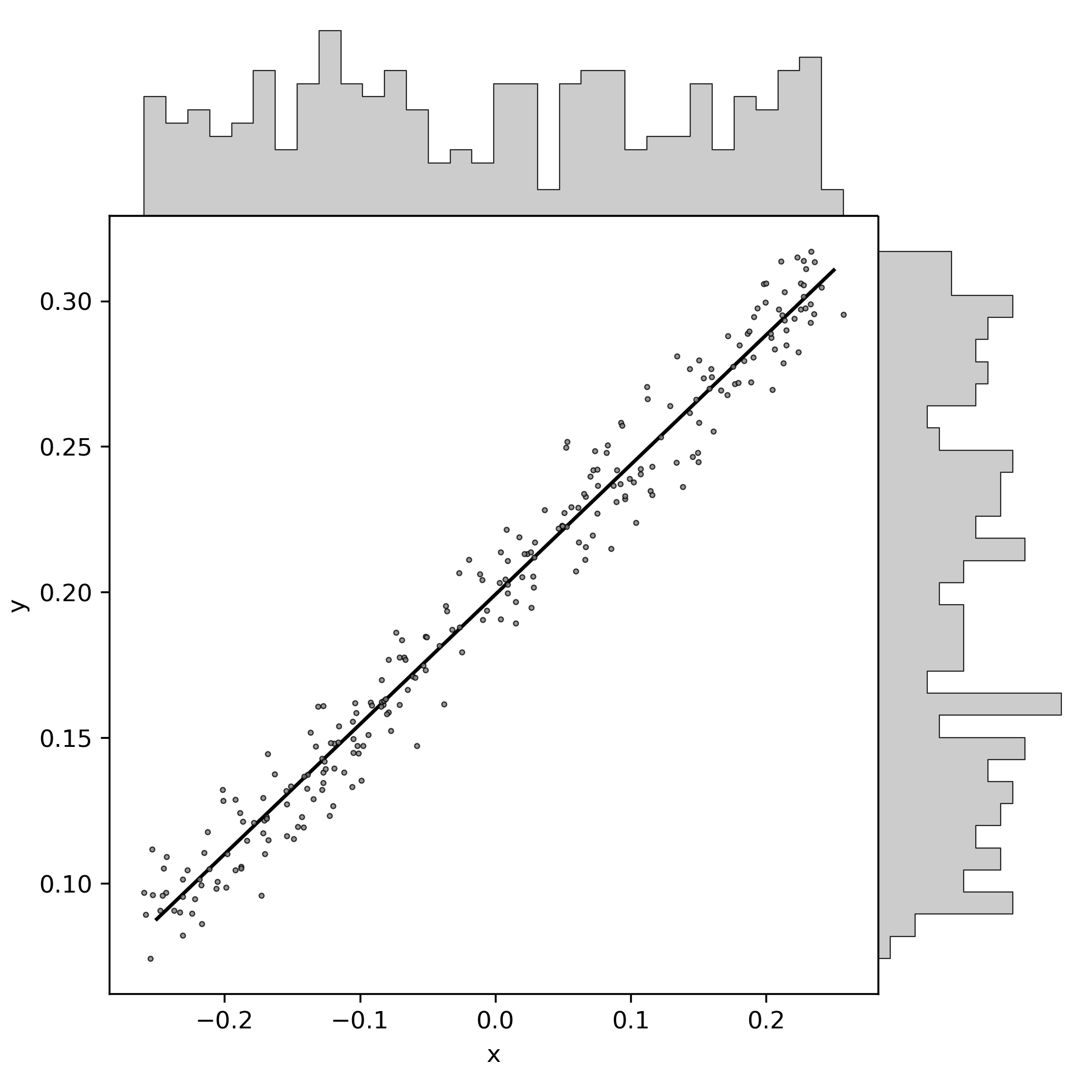
You see here some fake data: one set of \(x\)-values shown on the horizontal axis, and the “outcome” variable on the vertical axis. Gray scatter dots are the (fake) observations. Note the non-equal axis scaling, which must generally be considered as an inappropriate way of figure crunching, but the data is fictive anyways. The black line is the (conventional) regression model for the model of the formula above. Distributions are depicted as histograms on the margins.
You can think of this linear model in an “input-output” way: data “drops in” from the gray histogram buckets atop, within the range of the horizontal axis, and is projected to the vertical axis by the black line. Think of raindrops, dripping down from the buckets, and being diverted by exactly \(\frac{\pi}{2}\) at the precise point where they reach the black line. If you find this diversion of raindrops too magical, you might want to think of (light) waves which are diffracted (or, if you prefer, reflected, but then the input histogram would be better illustrated below).
The code for this particular plot is as follows, with the toolbox available here.
import LinearModelSimulation as LMS
import scipy.stats as STATS
import numpy as NP

sim = LMS.Simulation( slopes = [0.45] \
                    , intercept = 0.2 \
                    , x_range = [-0.25, 0.25] \
                    , n_observations = 2**8 \
                    , noise = 0.1
                    )
# sim.PredictiveSampling()

fig, ax_dict = LMS.MakePlot()

LMS.PlotData(ax_dict, sim, color = '0.5', label = None, zorder = 0)

regression = sim.LinearRegression()
ax = ax_dict['ax']
reg_x = NP.array(sim.settings['x_range'])
reg_y = regression.intercept + regression.slope * reg_x
ax.plot(reg_x, reg_y, 'k-', label = f'regression: y = {regression.intercept:.2f} + {regression.slope:.2f} x')

ax.set_xlabel("x"); ax.set_ylabel("y")
fig.savefig(f"""./show/bivariate_distribution.png""", dpi = LMS.dpi)
LMS.PLT.close()
And here is a nice plot twist: one can easily port the “rain” metaphor to illustrate probabilistic modeling!

Just as with the regular model, data pours in from above, yet it does not deflect upon a fixed line. Instead, the regression line is variable, summarizing all plausible (given the data) slope-intercept pairs with their respective likelihood. Think of a rain roof that swings and wiggles over time, projecting the dots to slightly different places.
# additional code for the probabilistic plot
sim.FitModel()
fig, ax_dict = LMS.MakePlot()
ax = ax_dict['ax']
LMS.PlotData(ax_dict, sim, color = '0.5', label = None, zorder = 0)


for chain in sim.trace.posterior.chain:
    for draw in NP.random.choice(sim.trace.posterior.isel(chain = chain).draw.values, 5):
        slope = sim.trace.posterior.isel(chain = chain, draw = draw).slopes.values.ravel()
        intercept = sim.trace.posterior.isel(chain = chain, draw = draw).intercept.values.ravel()
        # certainly there's a better way to work with xarrays.

        reg_y = intercept + slope * reg_x
        ax.plot(reg_x, reg_y, 'k-' \
                , label = f'regression: y = {regression.intercept:.2f} + {regression.slope:.2f} x' \
                , alpha = 0.1)

ax.set_xlabel("x"); ax.set_ylabel("y")
fig.savefig(f"""./show/bivariate_distribution_probabilistic.png""", dpi = LMS.dpi)
LMS.PLT.close()
But that was a digression. The main takeaway is that bivariate plots are useful. Their only downside is that they are 2D: we can only look at one slope at a time. This is in fact a severe limitation, as will become clear below.
MCMC Sampling
MCMC Sampling in the context of probabilistic statistics is the process of adjusting model parameters to achieve the best match between the model outcome and the actual data. Some call it “regression”, some call it “fitting”, some call it “training”, and proper statisticians may blame me for being agonistic to precise terminology in this case. It is a sampling procedure because the “sampler”, an iteratively adjusting pointer in the model parameter space, runs semi-randomly through that space to evaluate which values are good, and which not. “Semi-random” is my word for describing that sampling is not fully random (which would be error-prone and time consuming), but that clever update algorithms determine the trace of the sampler (e.g. Hamiltonian Monte Carlo). After an exaggerated lot of iterations (I’ll use the index \(s\), as in “samples”, to refer to their number), the sampler has hopefully converged to something that accurately depicts the true distribution of parameter values, as good as we can estimate it with the observed data. We call this outcome the “posterior distribution”.
Predictive Sampling
Predictive sampling essentially takes all the received probabilistic samples (pairs of slope and intercept in a simple linear model), also takes all the input data (observed \(x\)), and returns the hypothetical outcome \(y\) for each combination of observation \(i\) and slope sample \(s\). Because there are so many (\(i \cdot s\)) sample-observation-combinations, the outcome also takes the form of a parameter distribution.
Sidetrack: when writing this, I realized that all the above is dramatically simpler in the non-probabilistic case. One could just multiply all observations with the one regression slope. The reason people don’t do it is probably twofold, which I infer from my own previous blindness. First, I guess most conventional linear regression tools lack the convenience functions. Yet, I admit I haven’t checked too thoroughly. Second, the frequentist solution is just a single outcome; yet we know that there is an uncertainty or variation to our modeling result. To me, it was never directly obvious how to include the residual variation in the (single) prediction. I honestly excuse for exposing some agnosticism here to hundreds of years of honorable frequentist statistics; the Bayesian route has always been more intuitive to me.
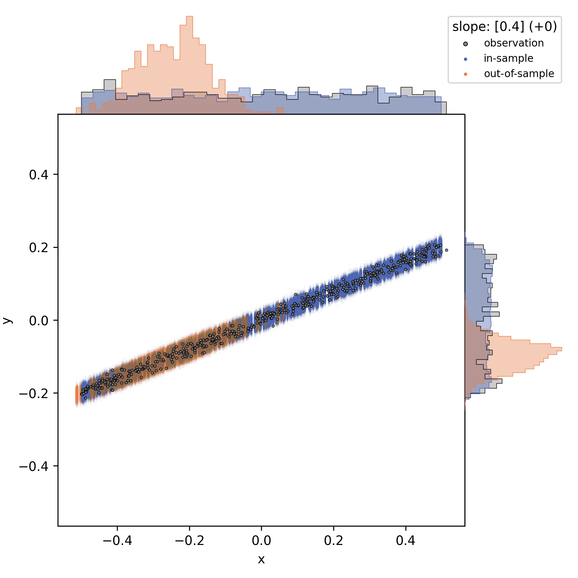
Whereas model regression (the actual MCMC sampling) is already finished and posterior distributions are fixed at the stage of “predictive sampling”, one can still change the observations. The default option is to use exactly the data the model was trained on, “in-sample prediction”. Instead, one could test any artificial values (“out-of-sample prediction”), for example extreme observations or just a random subset. And yet another common practice is to leave out some random subset of the data when training, so that it also stays out of the training set and can validate the posterior.
Data Segmentation: Training, Validation, Test
This latter one is an option I chose, for logical reasons. I segmented data into a training set and a randomly sampled validation set, both from the main “control group”. The validation set was left out for model fitting/training. The third, test set, was the “study group”, in my case low birth weight piglets.
fig, ax_dict = LMS.MakePlot()
ax = ax_dict['ax']
LMS.PlotData(ax_dict, sim, color = '0.5', label = None, zorder = 50)

reg_x = NP.array(sim.settings['x_range'])
reg_x[1] += 0.5*NP.diff(sim.settings['x_range'])
reg_y = regression.intercept + regression.slope * reg_x
ax.plot(reg_x, reg_y, 'k-', zorder = 60)

# first: in-sample prediction
in_sample_pred = sim.PreparePredictionData()
sim.SetData(in_sample_pred)
sim.PredictiveSampling()
LMS.PlotPrediction(ax_dict, sim, color = (0.3, 0.4, 0.7), label = 'in-sample', zorder = 10)

# second: out-of-sample prediction
x_pred = sim.PreparePredictionData()
mu = 0.75*sim.settings['x_range'][0] + 0.25*sim.settings['x_range'][1]
sigma = 0.1*NP.diff(sim.settings['x_range'])
x_pred[:, 0] = NP.random.normal(mu, sigma, sim.settings['n_observations'])
x_pred[:, 0] += 0.9*NP.diff(sim.settings['x_range'])
sim.SetData(x_pred)
sim.PredictiveSampling()

LMS.PlotPrediction(ax_dict, sim, color = (0.9, 0.5, 0.3), label = 'out-of-sample', zorder = 20)

ax_dict['l'].set_xlim([0.95, 1.1])
ax_dict['l'].legend(loc = 0, fontsize = 8 \
                    , title = f"""predictive sampling:""")


ax.set_xlabel("x"); ax.set_ylabel("y")
fig.savefig(f"""./show/oos_prediction.png""", dpi = LMS.dpi)
LMS.PLT.close()

The figure above illustrate in-sample prediction (blue) and out-of-sample prediction (orange). However, keep in mind that the out-of-sample data is intentionally chosen to fall outside the input data range, for illustration. Out-of-sample is not synonymous to “out of data range”! Out-of-sample just means that the model had not been fed with the data before.
The model is indifferent to whether or not the test set is congruent with the training data; it just performs the “raindrop deflection” with whatever you give it. In fact, the answer to this question, whether or not the training- and testing subsets of the data were congruent or not, is part of the answer to the initial question, as will become clear.
Summary: Modeling Visualization
The modeling wrapper I demonstrated above is a flexible toolbox to test synthetic linear models on hypothetical data. It allows us to compare “virtual experiment designs”: how accurate will my out-of-sample prediction match the data if I vary different constraints of the procedure. For example, I can vary the number of slopes, their values, residual variation, and details of the test set distribution.
The question to be solved for my thesis is the inversion of the following: when just looking at the outcome (distribution/histograms on the right y-axis): would I have inferred the observations and predictions to be different? Thus: given that there were differences in the control group (used for training) and the study group (used for prediction), how likely would I have missed them when just looking at the outcome histograms?
Results
Difference of the Training- and Test Distributions
If the training and test input data are (probabilistically) identical, then the prediction test output must match the actual output. This is the case with the validation data set (blue) above (note that I used a slightly different test set here). The validation set it is a random subset of the training data, therefore practically identical in data range and distribution. Validation is useful nonetheless, because we compare the predicted outcome of each individual data point to the actual observation.
I conclude that a (necessary, but not sufficient) prerequisite for perdicting group differences is a difference in the observation subsets, i.e. the \(x\)-values which were used for training and prediction. In other words: there must be differences in the input parameters of the control- and study group to begin with, otherwise a model cannot find differences.
slope magnitude
Near-zero slopes make the model indifferent to differences; the model will turn blind to differences on a zero-slope dimension. Zero-slopes can never cause predictive deviations, even if the test distribution is totally different from the data it was trained on.
This can be illustrated by gradually changing that one slope in the one-slope-model:
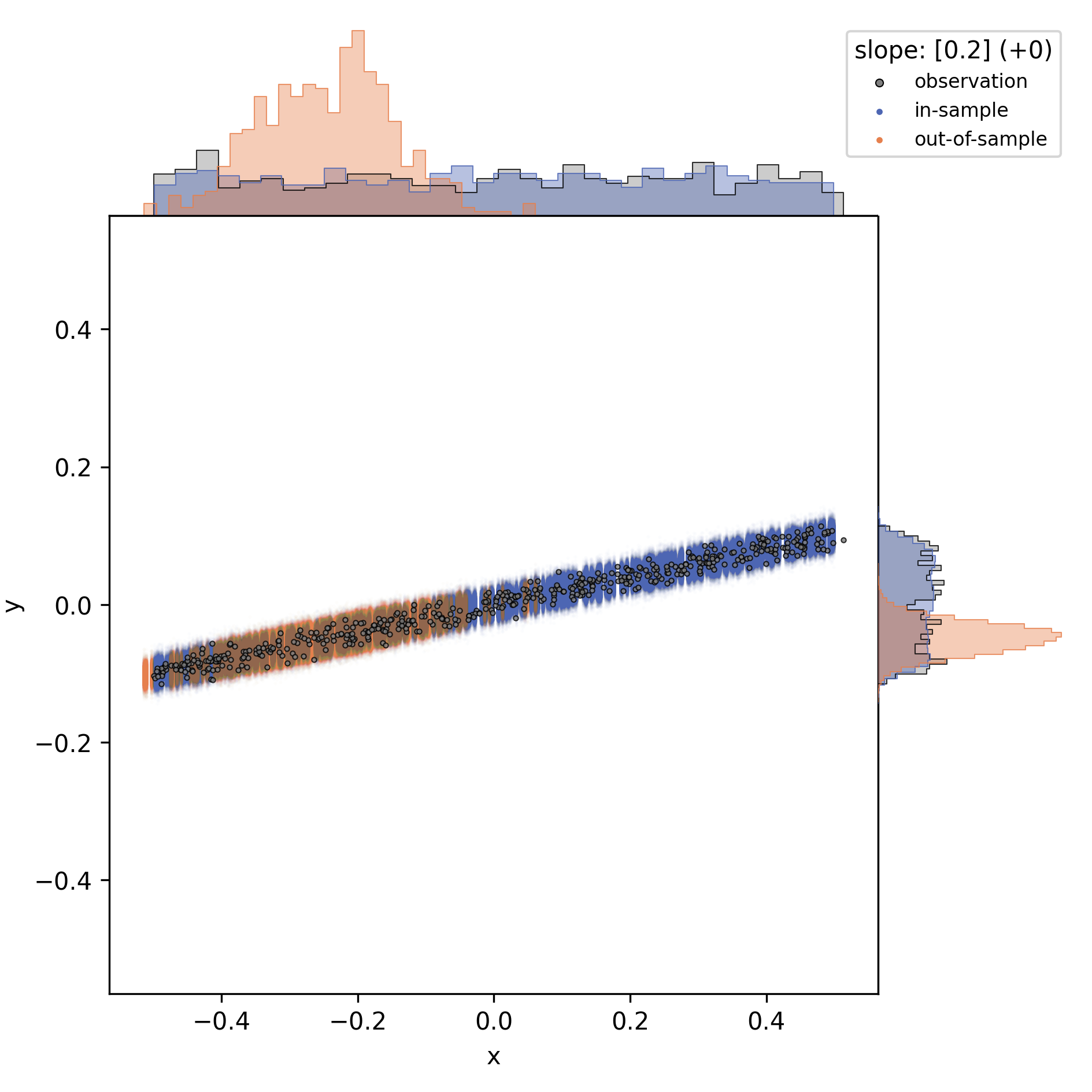

I conclude that a (necessary, but not sufficient) prerequisite for predicting group differences is a non-zero slope on at least some of the input observables. In other words: if all slopes are flat, then the outcome variable is indifferent to group differences in the input variables.
number of slopes
When increasing the number of slopes besides the focal one, and only looking at the focal slope, I observed that each slope adds to the “residual noise”, at least in the bivariate distribution display.
The figure matrix below shows a different number of extra slopes (vertical direction; slope magnitudes are -0.1, 0.3, -0.3, 0.1, -0.2) for three values of the focal slope (0.0, 0.2, 0.4).
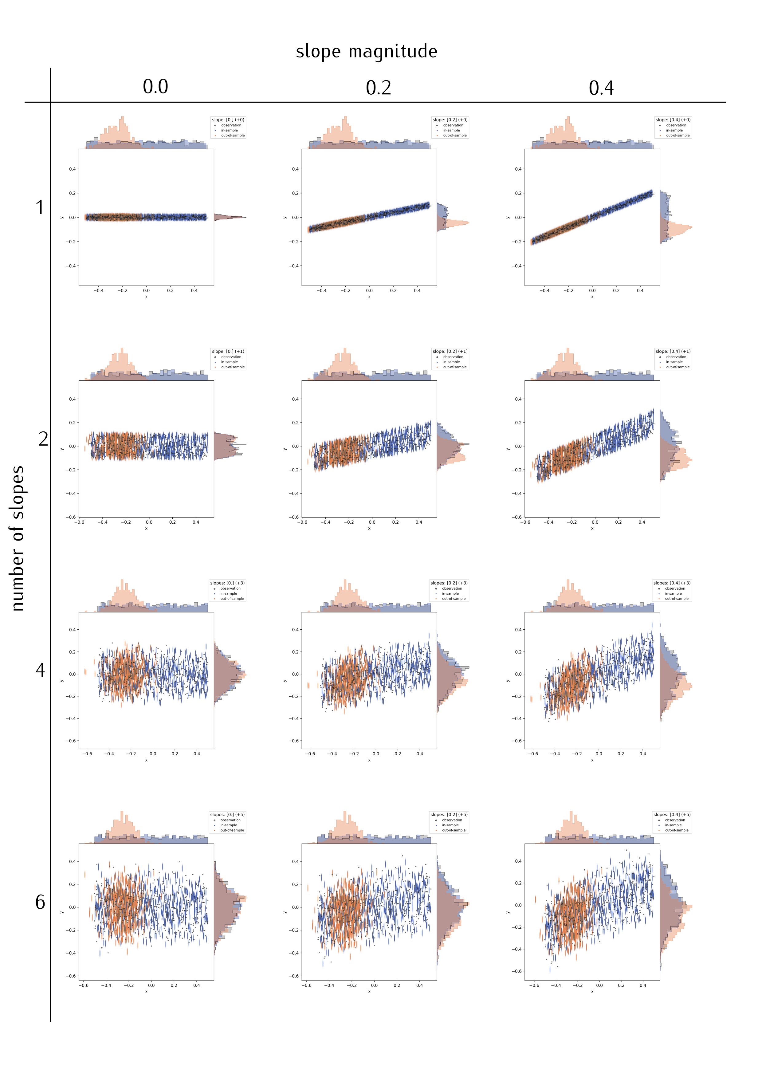
Comparing the panels along the middle column, and also comparing horizontally along selected rows, I arrive at a few, presumably general, conclusions:
- The more slopes, the more “spread” appears in the predictive outcome distributions; just as in additional noise (but note that the “noise” was constant in the simulated data). Assuming here that the slopes are independent/uncorrelated.
- This might partly depend on slope magnitude, …
- and on the actual residual variation (see below).
- This is actually an appropriate depiction of the (simulated) data, and no quirk of the regression procedure.
The reason is simple: a single observation (“y”-value) is related back to a higher-dimensional input space. Illustration is easy in discrete parameter spaces. Think of different character traits which all have three possible values: take three styles of hats, for example “cylinder hat”, “Clint Eastwood style”, “basecap”. With only those three, you have three ways to get a unique head cover; if there are four people wearing a hat, repetition is certain. Yet, add colors: the three types of hat can all be black, brown, or red. Now there are a maximum of nine unique head covers, with the brown “Clint Eastwood” style arguably being the coolest one.
This transfers perfectly to non-discrete parameter space axes. The more slopes, i.e. the more complex the linear model we apply, the harder it gets to identify the meaningful effects.
I conclude that a larger number of input parameters will complicate the identification of differences. A high number of model parameters can be detrimental, but not necessarily prohibitive for a difference finding. In other words: differences in the data subsets can be blurred out by an overly complex model.
Or can they? An alternative, trivial explanation might be that the problem arises here due to the simulation procedure. In the python script, I generate data by adding up slopes multiplied to random parameter values. Of course this widens the outcome distribution. In contrast, real data has a given width on the observables, and adding slopes will just segment the variability in different ways.
Hence, the finding that model complexity causes noise might be artificial.
residual variation / noise, and sample size
Two levers which can be easily tested with the simulation example I presented here, yet they are well known and I will skip their confirmation.
The first is residual variation: the more “noise”, the harder to distinguish two potentially different subgroups based on posterior predictive distributions. The second is sample size: all the factors discussed above were identified in a setting with dense and repeated sampling of the parameter space, which is by no means self-evident in actual animal experiments. Sufficient sample size is a known prerequisite for accurate predictions; inaccuracy in probabilistic terms translates back to more noise in the predictive samples.
Discussion
I herein presented a simple, but useful simulation framework to test different linear modeling situations. Applying probabilistic, linear models to synthetic data enables the explorative adjustment of all possible modeling constraints such as noise, sample size, model complexity, effect magnitude, and the distribution of observations. I demonstrate that unfavorable model constraints will usually complicate the identification of group differences. Conversely, the apparent lack of group differences can be caused by the modeling situation. Yet the situation is not symmetric: there was no setting I could tweak to evoke artificial effects. I am unable to create a model which would predict group differences were there are none. This means that, if the predictive strategy reveals group differences, they can be considered robust.
For my thesis project [1], this confirms positive findings (actual group differences). However, conclusions on predictions of indifference (which was also a finding, “negative” in the lack-of-effect sense) must be revisited: the model situation might have hidden actual effects. I will therefore compare training- and test data distributions, and check whether and which relevant slopes there are.
Which of the model constraints could I (involuntary) have influenced on the piglet models?
- Model complexity was a given: I extract a multivariate data set of locomotor parameters, and could not justify the exclusion of selected ones. In those models, the number of slopes is unfavorable, but inevitable.
- Slope magnitude and noise matter, but cannot be influenced. Slopes with little “predictive value” (as determined by e.g. by Leave-One-Out, WAIC and other information criteria) would probably also have caused little of the “added noise”. Large-effect dimensions will, upon removal, merge into unexplained (residual) variance. Hence, in a real situation, variance is given, and slopes should be added as long as they have explanative relevance.
- Sample size should be sufficient. Yet it is what it is.
- The distribution of observations must be taken into account. If models highlight a difference between groups, then it should be investigated which of the parameters cause that conclusion.
The rationale to move my analysis to predictive methods lies in the hope to get beyond descriptive analysis of locomotor data (cf. [2], [3]). This is a natural question in livestock [1]: prediction is diagnostics; can we infer deficits of an animal from observing locomotor performance. Yet caution is warranted, whereas enthusiasm about predictive strategies is not. From the considerations I discussed above, my takeaway message is that (linear) predictive modeling is biased towards positive findings. This is somewhat analogous to classical hypothesis testing: we can never confirm the null hypothesis, but quantify the chance of erroneously rejecting it (p-value), which is actually based on the comparison of distributions. Curiously, whereas modeling approaches are generally about the quantification of effect size, my interpretation of predictive modeling might link back to difference tests.
Maybe this is no co-incidence: after all, I compared the actual distribution of outcome values to their predicted distribution.
Thank you for reading! As always, questions, comments and feedback are most welcome.
References
- [1] Mielke, Falk and Chris Van Ginneken and Peter Aerts (2023): “A workflow for automatic, high precision livestock diagnostic screening of locomotor kinematics.” Front. Vet. Sci. 10:1111140. https://doi.org/10.3389/fvets.2023.1111140
- [2] Shmueli, Galit (2010): “To Explain or to Predict?” Statistical Science, Statist. Sci. 25(3), 289-310. https://doi.org/10.1214/10-STS330
- [3] Shmueli, Galit and Otto R. Koppius (2011): “Predictive Analytics in Information Systems Research.” MIS Quarterly 35, no. 3: 553–72. https://doi.org/10.2307/23042796